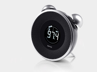
May be because the angle of the camera, i kind of enjoy the subtle light out from the screen. According to its description, the light is bearly seen during the night time. On the both the front and the back, i think it is reasonably good design.
The things that i disagree with are the firstly the control menu, because i get tired of bottoms are made of rubber. It is indeed flexible, but it dosen't offer a quality feeling. Ceramics are the better choose i think. Regarding of the bottom shapes, i feel a bit uncomfortable for it, but can't tell the exact. I also wish they could develop a better support.
YIFU


No comments:
Post a Comment