Sunday 30 October 2011

Calming Colours

There have been many studies on colours and how they affect one's ability to sleep and relaxation.
Due to the fact that my device is a transport sleeping aid, relaxing colour choice is integral to the aesthetic of the product.

It is quite common knowledge that cooler colours are perceived to be more relaxing than their warmer counterparts.
For instance, Blues, greens and white are often colours that are recommended for bed sheets, as these colours can sometimes help mild insomnia cases.

However, what I didn't know before delving into some online colour research is that the colour pink also has calming abilities.
Apparently there has been extensive psychological testing using this specific colour, these tests have involved putting violent criminals
in rooms with pink walls and monitoring the subject's behaviour and mood.

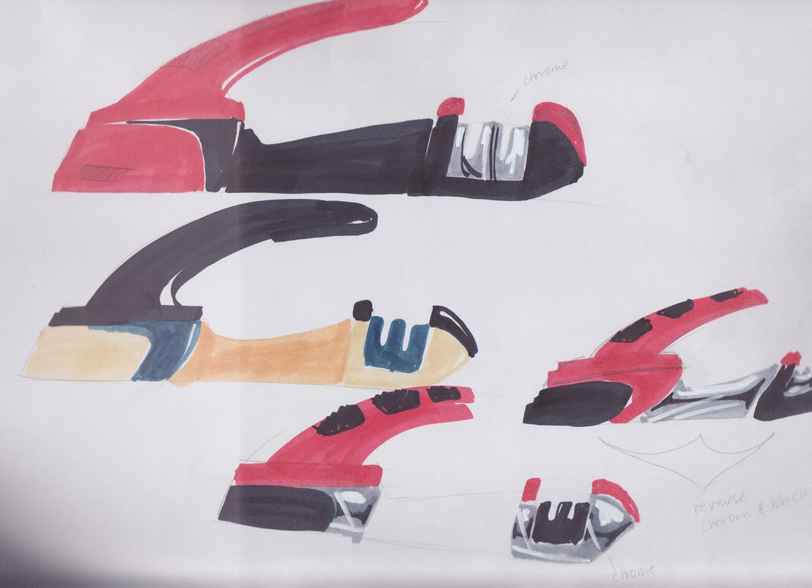
Furthermore, the product colour scheme also needed to be carefully considered due to the fact that the target audience of the "Sleep-Easy" device is both male and females, young and old.
Hence, I found it important to utilise a colour scheme that represented both genders paired with a neutral shade for balance.

Whilst it is true that not all women like the colour pink, which is quite often stereotyped I felt it important to feature an equally feminine colour, especially to entice the younger female age bracket,
a group which would be fairly likely to experience difficulty sleeping during aeroplane flights for instance. I felt as though choosing the colour pink would discourage many male consumers from utilising the device which may already be perceived as "pansy" or "wimpish". Hence in order to satisfy all demographics of the target audience a compromise was made and the colour lavender was chosen for the feminine aspect of the colour scheme, a hue which contains pink in its structure.

For the masculine colour I decided to go with a light blue as research shows that blue hues are the strongest in terms of promoting relaxation and sleep, and also due to the fact that blue would compliment
the purple colour, I really wanted to avoid complimentary colours because I felt it was important to maintain a harmonious colour scheme, again to aid in creating a calming environment.

Lastly I felt it was important to choose a neutral shade to balance the colours, a third colour seemed to be necessary any way considering the many components of the device.
I avoided black because it would be too bold and would contradict the already pastel aesthetic. White was also avoided despite the fact that it is a colour often recommended for bed sheets.
I felt this shade would be detrimental to the overall design of the device due to the fact that white naturally makes things appear larger than what they are. Because the device's technical
package is quite involved the product is already bigger than most headsets. Hence, I wanted to avoid making it look larger still. Furthermore, if white was chosen, particularly for the region that comes directly in contact with the wearer's head, then the device would stain easily, due to the oils that exist in human hair - something which would be very displeasing.

Thus, after careful consideration the shade of light grey was chosen as the final component of the colour scheme. It was selected due to being close enough to white to still have calming properties, without being susceptible to staining, and farther away from black to not cause any depressive and morbid emotions which would be severely detrimental to someone with a fear of flying.

After such a careful consideration process I am happy to announce that I am content with the present colours and am confident that they support the function of the device effectively,


Ashlee Shepherd.

Wednesday 26 October 2011

BD (breath device) color consideration

my design is a fresh breath test machine. The purpose of this product is help to detect the level of breath smell and give a result of the test,  it works with biological organism of human body and especially this product linked strongly with the feeling of fresh, because users want to achieve good results of their breath oder.

My first selection of colours would be blue, white, chrome/metal. Blue and white used frequently in cleaning product such as toothpaste, they provided closest feel of freshness and clean. The only reason of choosing metal is because i have included some parts (little circles button on the side) that very likely to be made out metal to look like a real product. I also considered about green, although i knew green represents sickness back in middle age in France and still does a bit now. Green is also associate with green tea and healthy. unfortunately it just dosen't look as good as other options in my color drawings.

After a reconsideration on my first color option. Maybe freshness is not the only answer to such product, i think there are some things that are more attractive for consumers to buy rather than a combination of blue and white ( this combination is too common seen in the market). In my drawing of different colours combination, the black and white really stands out of others. The white color seems like made out of ceramics and the black is very glossy. They look like a carefully designed product in the market.  Or maybe it is just stand against with these colors in my drawing, it is going to be hard to represent in the finally folio though.

YIFU (Sorry for late post, i did't manage my time well)

Sunday 23 October 2011

Colour scheme for moisture device

Sorry about the previous post. This is why I shouldn't have left my laptop unattended.


My device measures the moisture level in almost any object. There is a retractable sensor which is located at the tip of the device that comes in contact with the particular object. As the device processes, the other rings will light up, corresponding to the amount of moisture in the object.

The colour scheme i have adapted on my device are blue and white. The majority of the device is blue in colour whilst, the outer rings depending on the moisture content will either be white or blue. The outer rings which are white in colour at first are what is utilized to determine the moisture content of a particular object. The outer rings are like the 'moisture-meter' of the device. Once the device has calculated the amount of moisture in the object, it will light up as blue depending on how moist the object is; if the object is a hundred percent moist, the entire outer rings will light up as blue. as a result, the device would look almost identical to the shape of a water drop symbolizing liquid or in this case moisture. This is shown in the above diagram.

At this stage, the white colour that i have chosen will be 'creamy' white. However, the colour blue is still undecided as i have yet to experiment the different types of blue. It is still a work in progress.=]


- Hannie Choi


hannie is stupid she has to get his boyfriend to do her blog

My device measures the moisture level in almost any object. There is a retractable sensor which is located at the tip of the device that comes in contact with the particular object. As the device processes, the other rings will light up, corresponding to the amount of moisture in the object.

The colour scheme i have adapted on my device are blue and white. The majority of the device is blue in colour whilst, the outer rings depending on the moisture content will either be white or blue. The outer rings which are white in colour at first are what is utilized to determine the moisture content of a particular object. The outer rings are like the 'moisture-meter' of the device. Once the device has calculated the amount of moisture in the object, it will light up as blue depending on how moist the object is; if the object is a hundred percent moist, the entire outer rings will light up as blue. as a result, the device would look almost identical to the shape of a water drop symbolizing liquid or in this case moisture. This is shown in the above diagram.

At this stage, the white colour that i have chosen will be 'creamy' white. However, the colour blue is still undecided as i have yet to experiment the different types of blue. It is still a work in progress.=]


- Hannie Choi


Colours

For my Pollen Counting device, I think I am going to go in the direction of light summery colours. I think this would definitely suit the product as it will primarily be used in the spring time when the sun is just coming out and the weather is warming up. It would compliment the colours of the blossoming flowers, however once you saw these flowers, then you would most likely have to move away because you would probably be allergic to them. However, I am considering beige colours, perhaps a beige green for the main body of the device and an off white to compliment it. But this is just planning out in my head. Some experimentation must be done. I really like the hue colours on the colour wheel and will be playing around with those colours to get a right balance and a secondary colour to compliment it. Like I said, the inspiration comes from the light summer colours and the blossoming flowers that will arrive in the spring time.

Raz

colours for recycle bin

I actually have not decided the colours yet.  I was having trouble with choosing colour always, when I dress up or choosing right and interesting colour for drawing. I am having Bit of struggling with colour. So I will write about the colours that I like for my recycle bin

Recycle bin has narrow choices of colour scheme. As It is a recyle bin, of course, green colour is highly recommended.  And the material of recycle bin is metal. So It probably has metallic colour. That is pretty simple and general colour scheme for recycle bin.

It gives such friendly feeling. The purpose of my concept recycle bin is to encourage people to enjoy recycling.Green and yellow are good choices. As yellow is analogic colour of green, they go well.

Colours!

Just to refresh, my product is aimed towards toddlers and kids - and yet, it's quite industrially designed so it needs to fit into both categories. I experimented alot with bright, vivid colours to attract young kids and while some looked borderline okay, most came out too strong and did the opposite by putting people off (it put me off). In my concept pin-up, I mentioned how I disliked the colour choices as I believed it made my design look too busy. The green with the blue and the silver; it took out all the simplicty I wanted to imply in my product. In photoshop, I dunk multiple colour combinations and came to a realisation that having two or more 'bright' colours destroys the design completely. It definately goes to show how much colour can impact on a design alone. In the end I went for the furthest on the left as the main colour is emphasized through the subtle shades in the body. It was, in my opinion, the best solution to fitting both target audiences utilizing the bright blue handles to attract the kiddies while still reserving the sophisticated design for the adults.


Karen

Colours.

So far, a choice of colour has not come naturally.

Hence the experimentation above, which unfortunately has not succeeded in identifying a specific winner. The difficulty is in the wide range of users. Diabetics are not a specific type of person and have no unifying taste. The glucometer is also a device which is used extremely regularly and is therefore a very personal device by way of familiarity.

Hence, I would offer the glucometer in a range of colours to cater to a wide range of individuals, some wilder in colour scheme than others. However, for my final design I will be keeping the colours reasonably subdued and professional for presentation. Robbie mentioned white was a colour many associate with cleanliness and hygiene therefore I'm moving towards while, blue, red and silver as my colour scheme to express the medical nature of the product whilst the silver connects the metallic watch component to the glucometer.

Hopefully I can nail down the colour scheme in the next few days, need to get painting!

Ed

Colour Clarity

Despite the title I am in no way clear on colours for my final design. The title refers to a prevalent theme that has hindered the later stages of my design curbing. As part of my design I need a section of to be clear in order for the user to observe difference of colours in a liquid; this brings up an interesting (but by no means overarching) question: what colour goes with clear plastic?

This question will not dictate the entire spectrum of decisions needed to choose a coherent colour scheme but to me it was the most endlessly perplexing (I dare you to find sense in the term "most endlessly something"). I will continue to push forward and look at nature and, scientific and biological research facilities to create a colour scheme that best fits in its environment and informs the user about the product at a deeper level… or I could make the whole thing out of clear plastic.

-Tahl

Saturday 22 October 2011

Pure colour

The colour scheme I have decided on for my water quality tester will use a dominant gray tone with blue highlight sections. I looked at different options for colours from scientific instruments due to the devices scientific basis, but also considered appliances and outdoor camping equipment due to the various environments it can be used in. The scientific and household appliances research lead me to using the cool gray, I have not yet determined if it will be a light or darker tone. The blue highlights will be on the buttons at the front and the logo. The blue relates to camping equipment as it often has one bright attention grabbing colour so it can be easily seen, but my blue will be less intense. The buttons will be contrasting to clearly show the user the intended way to hold the device.  The body and buttons will be painted using high gloss paints, but the grip at the rear will be painted using a black rubberised paint to replicate the material it would be produced from.

I looked at using other colour strips/sections and various colours, although I think they looked good they gave the device a sporty look. I ended up using blue as it relates to the pure water which the device is used to test, so it connected to the purpose of the design.

The colour scheme in the bottom left of the image is very similar to what I will be using, the tone of the gray needs to be considered, and the logo will go where the text is placed.


Jarrod Burge

COLOUR!

For my bacteria Measuring device, the colour scheme i have chosen is a light grey for the main body, and with a darker grey for sections around the hatch and the handle. I needed a colour that would match/compliment the colours of the light indicators Green, Orange and Red. Originally i was thinking grey colour for the Body with another colour for the handle and hatch. But this was hard trying to find a matching colour that suited. I was seriously considering a deep blue for the handle and hatch, but then it occurred to me that it was starting to look like a rainbow. Therefore, i removed the blue and thought of the darker grey, this way it all ties together nicely, and for being on the bigger size of the models i needed to be more cautions, because anything to drastic would be disastrous. At the moment i am sorting out the different colour sections which are indicated by the photos. 

Over and out Tegan :)

Hydr8 Colour Scheme

Although there are many brightly coloured drink bottles on the market today they are all made from opaque plastics and do not have the ability to change colour.  When deciding on the colour scheme for my design I had to be careful not to choose any colours that would clash with the light source which identifies the user's level of hydration.  As this can be green, blue or red there is no colour that would blend nicely with all of these. Since I didn't want a stark contrast between the bottle colour and the light I decided to select a tonal shade such as a cool grey. This will also allow it to be used in many different environments from the sports field to the office.


I am still deciding on the additional features such as the colour accents  and product logos. However, as the image shows, I am currently thinking of a pinstripe accent which includes the name of the product. I am also still deciding on the colour for the button and the reader however I think that a slightly darker gray with a bit more blue would work. I would appreciate anyone who knows a font that would work well with my design to comment.


James Meikle


Colours

My design, the atmosphere evaluator is a wall mounted device equipped with a remote control. Because of the remote control feature, I have designed the measuring device such that the colours and the lines of both components of my design match together. Therefore, it is easier to associate the remote control to the main unit.

Since the main function of the design is to help the user to create the best atmosphere to study, I have chosen the dominant colour to be white. White is a neutral colour and can easily be associated to wall-mounted electrical devices such as air conditioners, smoke detectors, etc. Also, I have decided to colour the patterns in either some light cool or warm grey. Those two colours do not contrast too much with white, and are very subtle. A colourful design would defeat the purpose of the device as it would most likely distract the user. I believe that the combination of white and light grey can fit in any environment, as it helps to create a calm atmosphere compared to some bright colours.

However, I intend to add a hint of colour to the design, to make it more original and less plain. I'm thinking about a different colour for the button, most probably blue or green. A coloured button will attract the user's attention when handling the remote control and make the user want to interact with the device.


Dwayne Chung

Colour Scheme Variations

My design consists of a lot of glass, probably 2/3's of the design is a just glass. This means that my design requires a colour scheme which will give more emphasis to the glass sections as they are the main part of the design with which the user interacts. I have considered colour schemes which are very subtle and dark. The colour schemes of the buttons and latches are brighter as they need to be noticed more than the main body of the design, but they also need to be subtle enough to not take away the emphasis put on the glass sections. My product is really a household product and i have taken inspiration for the colour schemes from dyson vacuum cleaners which are also household products. The colour schemes used in their products are also reflective of the same emphasis i want to put on my product. The subtle grey and the yellow and orange trims work together very well to give the user a sense of where everything is like buttons etc... 

Bishavjot Singh

the colours of sound

Hi all!
So the last blog post for this unit... I had better make it a good one....

My choice of colours for the body of my product has been dictated by the design and its environment. My sound measuring device is wall mounted and has two sections on either side where lights illuminate at different levels of sound to alert workers near by. I wanted these lights to stand out so they could be easily seen my anyone in the workshop/factory. This meant that the body of my design could not be a bright colour, say yellow for example. This would make the lights harder to view. I need a contrast of colours in my design. 
Consider traffic lights. The traffic light unit is black so that the colour of the lights can be read by drivers no matter what is behind the traffic light. I did not want my device to be black or white, as i think these colours are a bit extreme. I decided to settle for a darker grey which would provide the level of contrast that I wanted for my device.
I have chosen red, orange and green as the colours for the lights because they are easy to understand. Green refers to good levels of sound, orange refers to ok levels of sound, and red refers to damaging levels of sound.


Thanks for reading all semester!

Matt Harding  


HUEge Decisions.

For my device i need to keep the colour scheme low key and consistent.

There are many considerations to be made when producing sports equipment. As my device is aimed at more elite sporting induviduals, sporting team and institution colours are extremely important and you do not want the scheme to clash with current attire or send a mixed message about whos on what team to the external viewer.

Bottom line, colour choices are going to have to be understated and subtle however posess a certain boldness that shows off the product without hindering the visual communication it posesses as a sporting aid for teams and solo players.

-Robert Schoch.

Colour scheme

I have been mulling over possible design decisions for a while now, as I feel it is quite important in implying the design direction I have taken the device form-wise.

What I mean by saying that is that while my device needs to be discreet in order to effectively measure productivity, I also wanted to inject some personality and style into my measuring machine, both for the sake of prospective buyers and to make it more interesting to design.

As a result, I have imagined a device that borrows aesthetics from tactile 50s and 60s era products. The main inspiration comes from the microphone grill on the front, which has been taken from the classic 50s microphone. However, applying a chrome finish to the product would make it look garish and obnoxious. It is designed to look neat but ultimately fade into the background of classrooms and office spaces. I have have chosen to go with a cool to mid-tone grey with a tiny blue tinge to evoke the soft metallic look without being too overbearing.

The colour is also inspired by the industrial-looking cool blues of 60s and 70s sci-fi films, because I like the style and think it looks slick, but still very grounded and real.

-Tom Millward

Colour Choice....

Choosing a main colour for my bushfire warning system was quite easy when i did a bit of research of related devices. As shown in the above images and almost all examples of weather stations that i found, they are almost alway plain white. At first i thought it was just a boring result of a boring device but after consideration i realised its all to do with practicality and reliability. If you think about, these weather stations are constantly exposed to the elements and especially in Australia, a day of sunshine has a massive affect on the temperature of an exposed object and its internal components. For this reason, and to achieve a more realistic result, i have chosen to colour my device with a similar white with grey accents to break up the object. I also believe the white is a very neutral colour that will better fit in with its surroundings during all weather conditions compared to bright or darker alternatives. i have chosen to go with a polished aluminium case for the handheld device due to the fact that one of its key requirements is that is is always clearly visable.

Sean H

colour scheme

For my hydration measuring drink bottle, I wanted to use colours that could either be specific to a type of sport or exercise or be a colour that can relate to multiple sports. I wanted to keep the colours simple and that work well together, so not clashing colours. So I decided that I would keep the main body of the bottle white, grey or black, and the lid/mouthpiece and grip a colour. I experimented working many different colours together such as blue, red, green, yellow, etc.

The colour I found that worked the best and could relate to many different sports is green and white. This colour scheme would also include a dark/navy blue for the led indication of hydration level. These colours are also fairly unisex, so girls and boys, or women and men can use these drink bottles.

KATE 

oops

'colour refinement...' is holly's!

colour refinement...

For my device, which is used as a tool in the study and work environment, I drew inspiration from colours that are often used or seen when studying. For this, I looked at coloured pens, pencils and textas, and of course the iconic highlighters.

For me, I have always used these colours when studying for a test or exam, and tend to colour code everything. By using these colours in my own design I would hopefully be sparking a memory or thought in the mind of the user. I am still refining the colour and material choice of my device, and am also looking at toning these colours down so my device is less dominant on the desk. 

Other colours that sparked my interest were yellows - as these are supposed to be good for memory retention, reds - for enthusiasm, purple - for creativity, or white for clarity and a blank canvas. 

Perido - colour

Although 'Perido' may sound like 'Cheerio's' as I discovered this week in class, it appears that there may still need to be some refinement with the name and unit measure name. Aside from this, my Google search readings on colours that women seem to lean towards pinks and purples (girly colours), is false. Women also like green and blues and oranges (this increases with age). It is difficult to determine, which colour would suit best and then there is the introduction of finishes too.


Having taken on some of my light Google search readings into consideration, I feel that I am leaning towards a whiter pearlescent colour than a matte solid colour. The application of this in spray paint for my model might be an issue but I am hoping to find a paint 'mixeruppera' person who might be able to help me out with this. Hopefully this sort of colour with give 'Perido' a softer look to it, without it being too invasive or loud in colour.


Details to the bracelet could consist of a thin band of aluminium through it as a trim. Something I am still tossing a coin over about.


Attached is an attempt at showing some soft colours that I considered as a base colour and then would have a pearl finishing coat to it.


Over and out...Mote.

colours...

For my 'space sabre', which is essentially a 3-D portable scanner, i found basic colour schemes suited it best. In my exploration of various colour combinations, black and chrome was found to be the most effective choice. This was because most bright colours detracted away from the industrial aesthetic i was after. Seeing as my product would quite expensive because 3-D scanning is such a new technology, i thought it would be important to choose colours that exudes quality. I found the contrast between a matte black rubber grip and a shiny chrome like metal texture of the body of my torch like device worked the best.
 
My inspiration was high range power tools an other industrial equipment, along with high end kitchen appliances like coffee machines. This is because both 3-D scanning can be applicable to both industrial and domestic use. Sorry for the lack of images, I'll be sure to put some up in the not too distant future.
 
Rohan
 
Image sources:

Pain measuring colours

As my product is a medical device the purpose of the colour scheme is more about increasing functionality and user interaction rather than purely aesthetic. I have approached the colour scheme selection so as to provide the patient with a visual cue. The cue is in the form of a highlighted front panel. This is so the patient instantly understands the contact region or at least recognizes that the area is of greater importance compared to the rest of the device leading to hand exploration and interaction. The colour scheme picture above indicates that the buttons will also share the highlight colour which I've since decided won't be useful and will detract from the highlighted front panel. Symbol illustrations of the buttons purpose will provide more focused instructions to the operator to reduce operation error which is vital for medical devices. I've chosen a dark Toyota grey for the main body color and a light green as the highlight (similar to the model on the bottom right). All surfaces will be a high gloss shiny finish to aid in sterilization of the product between patient use.


Ben Paul

(planning to make profit out of pain)

Colour scheme

My design is a wristwatch which measures vital signs to estimate the health of the user. This poses challenges when selecting a colour scheme. It should be something clean looking to denote the medical nature of the product, such as the white plastic devices we see in hospitals, but at the same time it is a personal accessory, so it should also be able to suit a wide variety of outfits and personal tastes, whilst also being fun and fresh. I also decided my design should not be tailored more for one gender, so I have tried to keep a colour scheme that appeals to both men and women.

What I came up with is a stainless steel band, with brightly coloured rubber, or soft plastic, sections, and a similarly coloured hard plastic face. The face has been kept as all one colour  to simplify the scheme, which hopefully makes it look fresh and friendly, and widens the range of the target audience because it doesn't fall into a specific aesthetic style.  Hopefully this means not all people will love it, but that most will enjoy it.

Inspired by products that come in a variety of bright colours, such as the pictured range of iPod nanos, I played with the idea of making available a number of differently coloured designs with the same basic scheme. I have since pared it back to only three colours: the green, orange and blue shown above. I think these are great colours for my product, because to me they represent vitality and wellbeing, which tie in well to the themes of the product.

Scott Everitt

Color selections for my Love Bungle

For my 'Love Bungle' , I simply mode it in photoshop, and rendered it with different color combinations to find out the best color scheme.  Most of my color combinations are light bright color for the parts, and white or chrome color for the middle body. Due to the characteristics of the bungle, which it may be regarded as a toy instead of a scientistic tool in the market, the color should match a good mood of the consumers, in which way, bright and light colors are recomonded. I keep the color of the wings the same as the parts of the body to make sure every parts in the bungle looks harmony.

 I did some research of the color of digital watches in the markets currently,the silver (chrome) occupy most of the markets. I tried white in the middle as well. the real model will have several concave strips in the middle, which can make the bungle looks more like a mechanical device, as I named it before, 'Mechanical Love Bungle'. 

At the moment, I thougt orange and silver is the best comnination, but still struggled with the color of the buttons, should I use silver for the button(on the orange parts' surface) or choose the third color? For painting, I might paint them seperatly, but some places I dont wanna show the product lines ( gaps), still need to figure it out. especially for the middle body, If I paint before I put the screen on, there will be a gap in the middle of my middle body; if not, the screen may be painted when i paint the bungle.

Any suggetions, just let me know plz, thanks,

Aodong Wei

colours

For my Knife sharpness measuring device, the colour scheme i have chosen and i think works the best, is a combination of one bright colour with additions of black and chrome. The bright colour will most likely be red as my design is meant for the kitchen and numerous objects in our kitchen are red. I feel that the black and chrome will give a nice sleek look to complement the red.

 i am however having much difficulty with deciding where the colours are placed as i am going to have a few separate parts. This is something i need to work out.

The intended material is likely to be a gloss plastic with rubberised parts for the grips on the handle and underneath.

LachMarsh


Hi all,
Choosing the colour scheme for my bicycle handlebar is a bit of a hard one for me. Because I'm only choosing to design the handlebars and not the entire bicycle itself, I'm struggling with going for colours, that when put on the body of the bike, don't appear to mismatched. 

Over the week, I've been looking at colour schemes that can be matched to any coloured bike body. It was easy to decide to just slap on black to the entire handlebar, but it seemed too boring. At the moment I'm looking into having black or a dark grey as the main colour of the handlebars, and having subtly coloured (perhaps white and lime green) regions to highlight little features, such as rubber grips, indents on the dial and key shapes. As white is rather neutral it seems to go well with most colours (similar to the image above), while the small applications of lime green will draw in the attention, but not appear to overwhelming in comparison to the bike body. Lime green was also chosen over other colours because of tendency of human eye to recognize more shades of green than any other color, in keeping with the 'visibility' theme.

Also, I'm wondering if there is a way to paint rubber. The guy at Clark Rubber said it wasn't possible to paint rubber because the paint would crack as soon as the rubber was moved. Please let me know, thanks :).

--
Cynthia

Colour Scheme

For my product the colour scheme needs to be fairly neutral as it is designed to be in an office/desk environment. I am still going through the process of choosing a final colour combination but it is either going to be.
1. White/light grey body body with black glossy details, buttons, dials etc...
2. Dark body with glossy details etc...

I have chosen these options as these colours are both neutral and most offices will predominately feature one of these two colours

Stefan

Friday 21 October 2011

Colour Options

Hey everyone,
 
I've been playing around with different colour options for my measuring device, paying close attention to hand-held power tools.
 
My product is designed for industry; for someone who is using it on a regular basis. Most power drills are very bright and have contrasting colour combo's to make them stand out from objects around them, and I think this is an important factor to keep in mind. Instead of going for sleek silvery/grey shades that can sometimes blend into their surroundings, I've decided to take inspiration from the Ryobi power drill above that I bought dad for fathers day. One of the reasons why I bought it was because it was the first one to jump out at me when I walked into Bunnings, with it's strong lime green casing and charcoal grey rubbery grip.
 
The second image is a quick sketch of my device with this colour combo. I'm still playing around with different configurations but I really want to stick with the green. There are too many tools that have yellow/black colour schemes as well as orange/black combo's, so something a little different is always good. 
 
Cheers,
 
Matt Van

Road Rage Colours

For my road rage steering wheel, i tried a wide range of colours that looked appealing to me. The way i decided on my final colour scheme was based on two things:
1. How well it suited a car environment.
Since most cars don't have bright colours around the interior i had to choose some that were found more regularly such as; white, greys, black, creams and wood colours.
2. How well it fitted with the output (being to calm the driver).
A few of the colour schemes i choose had an aggressive feel to them which is not what i want for my design.

The final colour scheme consists of a satin white on the base plastic and a warm brown grey leather wrap for the upper grip.
Shaun T

Task Light: Colour Scheme

Apologies for the old image I'm showing here, there have only been a couple of minor changes, and none affecting colours.

For the vast majority of the form I'm sticking to the material's natural colour. For the frame, head unit and base unit that material is aluminium, so the colour will be that of a brushed metallic surface.

I've found a nice creamy cord to run down through the middle, so I thought I should only use one other colour to bring the cream and the metal together. What I'll refer to as 'accessories' (being the power plug, sliding knob, cord and strut connectors, twisting knobs and gear) will adopt a darkish grey (contrasting to both the cream and the metal). These minor details are dispersed about the form, creating a coherent visual pathway around the lamp. I think a dark grey for these will conform to the shades of grey produced by the gaps between the metallic panels on the base and the head unit.

I feel sticking to the basics colour-wise will suit my design.

Nicholas Avery

Assessment - and a call for volunteers

Hi All,

Firstly, I have marked your research 5 pagers and they can be picked up from my office. If you're in the workshop next week then pop upstairs on mMonday morning or Tuesday and I should be there.

Secondly, you might be aware of the 3rd year show which is happening from 6-9pm on Melbourne Cup DAy, here in the studio.

You're all invited to this show, and its a great insight into what's coming up in the following years.

Importantly, I need a few volunteers for the evening - you would be serving drinks for about a 40min shift, and therefore please contact me if you are available and have a valid responsible service of alcohol certificate (RSA).

please get in touch if you can help out.

best regards

Robbie

--
Dr Robbie Napper
Lecturer
Industrial Design
Monash University
p) +61 3 990 31059


Matching Designer Harness

Because my product will mainly be seen attached to a climbing harness I decided the colour scheme should tie in closely with those used by harness designers. The most widely recognised brand in climbing harnesses and accessories would have to be Petzl (you may know of them by head-torch fame). I am choosing to brand my device with the Petzl logo, so it makes sense that I should choose the brand's overarching colour scheme of black, grey and orange to use for my device.

I have attached pictures of a top of the range black, grey and orange Petzl climbing harness, as well as a slightly cheaper Black Diamond harness with a basic rendering of my device attached to the back.

Sam F

Wednesday 19 October 2011

colour me....

Due to the nature of my heat sensitive travel cup and spoon, the
product will be available in a large range of colours. The aim is to
have a bright mitch and match colours for the lid, body of the cup and
the spoon, allowing users to pick and choose as they like or even
prehaps select a few different colours for those fashion conscious,
matching maniacs. The colours will of course change in tone to lighter
and darker shades depending on the temperature of the food or drink
that the material is in contact with. The cup will also come in two
sizes, one designed more for children and students with smaller hands
and another for working adults.

Inspiration for the design was brought about largely by the everyday
use of the throw away coffee cups from cafes and later by similar
products with a silicon material, which has proven to be a highly
durable and well suited material when dealing with food safety and
higher temperatures. Decisions throughout the design process have
largely revolved around restrictions regarding materials, form and
function while still trying to maintain a good level of aesthetic
appeal. As the model is still in progress, finer detailing and
decisions have still to be made and finalised. Its never really done
is it?

Steph Tan

Wednesday 12 October 2011

IDE1112 Final Assessment Dates

Hi All,

Further to our informal discussions yesterday, and some negotiations on the timing of everything, here are the finalised assessment dates and times for IDE1112. It's good news for all.

Models: for all students, whether enrolled in model making or not, this is the 14th of November as per model making. For those in model making, I will assess your design as communicated in the model when you set these out in the workshop for Peter Farrer. If you are not in the model making unit, these can be submitted directly to my office on this date or before. If you're ready, you might even bring them to submission of:

The rest (Pin-up, folio, written conclusion): Due on the 8th of November, 1 week extended from the schedule. This will be a short 1.5hr session at 9am and 1pm where you can present your work and we'll wrap up the unit.

Just a reminder, there is no blog post this week. Next week is the last one, it will be on colours.

kind regards,

Robbie

--
Dr Robbie Napper
Lecturer
Industrial Design
Monash University


Tuesday 11 October 2011

Phones

I just looked at the blog and realised that my blog post wasn't posted, so I 'm sending it again.


Many years a go now when I bought my first phone, I was confused by the disparity between the quality of construction and user interface in mobile phones and other products. My confusion stemming from the fact that phones were pretty crap, really.

It's only really with smartphones now that the gap in quality between mobiles and other consumer electronics has closed up. Nokia phones are sturdy as hell but their in-house UI up to this day is awful. All mid range phones from the mid 00's and before had terrible designs that buried potentially great features under catacombs of menus. LG, Motorolla and all other manufacturers had the same problem. Looking through my nokia E71 that came out maybe 2 years ago, it takes me more than 10 button presses just to get to the menu where I can change my ringtone.

It's only with the iphone (hey!) that phone manufacturers caught on to the idea that there was something to making a usable interface. That said, the UI of the iphone isn't perfect, the wall metaphor used to display apps gives the same real-estate to an app that makes fart noises as your mail client. I don't know how I'd make that better though.

I also think it is arrogant to basically port this interface onto their computer OS because moving your mouse to click on the apps just doesn't work as well. it was designed for touch screens.

Windows phone seven attempts to address this by assigning different sized panes for different apps, it feels more minimalistic but less functional I think. Even google's android, which is starting to take the place of the UI on every phone that isn't put out by microsoft or apple really just apes the iOS "wall". Also the store is really cluttered.

I feel like such a hypocrite complaining about this stuff though because I have no idea how to make it better.

-Tom Millward