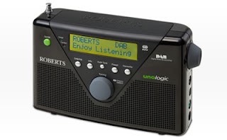
Even though well developed technical functions, I have chosen this radio as the worst designed one. Roberts Unologics is lightweight portable radio and is environmentally friendly product. It has alternative energy source by normal battery, reusable battery and an adopter.
The first reason why I have chosen this as the worst is because of buttons. The small button in the middle of front surface makes me feel like the buttons are not well arranged. Four buttons are bigger than the middle one. It would be okay if the middle button is the same size. It could be said the designer made the smaller middle button distinctive but this distinctive small button makes me feel this radio is arbitrary.
In addition to this, the button on the side is bit annoying. That Button is too big so it makes me feeling like it's a tumour on the radio. If it was smaller. It would be better.
the colour skim is a bit mess as well. Because this radio is made of environmentally friendly material, they try to emphasize "environmentally friendly" and used green colour for on/off button and the logo. Green colour is pretty dominant in this radio. It's eye popping. However I don't feel any connection between the whole parts of radio and the green-coloured button and the logo.
If you look at the front surface you can see many logotypes that they do not need to be there, The Company's name, the name of radio, functional ability which we do not care when we use radio. When it works well we are all happy. Frankly speaking, we don't care of what kinds of technologies are applied in this radio and which company made this radio unless the company is pretty famous to show off. But they even put the company's name twice, in front and on the top which is unnecessarily on there. So if I were the industrial designer of the radio, I would just leave the some of logotypes out of the radio and rearrange the locations of them.

forgot to put my name, Richard
ReplyDelete