Sean H
Saturday, 22 October 2011
Colour Choice....
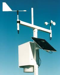
Choosing a main colour for my bushfire warning system was quite easy when i did a bit of research of related devices. As shown in the above images and almost all examples of weather stations that i found, they are almost alway plain white. At first i thought it was just a boring result of a boring device but after consideration i realised its all to do with practicality and reliability. If you think about, these weather stations are constantly exposed to the elements and especially in Australia, a day of sunshine has a massive affect on the temperature of an exposed object and its internal components. For this reason, and to achieve a more realistic result, i have chosen to colour my device with a similar white with grey accents to break up the object. I also believe the white is a very neutral colour that will better fit in with its surroundings during all weather conditions compared to bright or darker alternatives. i have chosen to go with a polished aluminium case for the handheld device due to the fact that one of its key requirements is that is is always clearly visable.
Subscribe to:
Post Comments (Atom)


No comments:
Post a Comment