Saturday, 22 October 2011

colour refinement...

For my device, which is used as a tool in the study and work environment, I drew inspiration from colours that are often used or seen when studying. For this, I looked at coloured pens, pencils and textas, and of course the iconic highlighters.

For me, I have always used these colours when studying for a test or exam, and tend to colour code everything. By using these colours in my own design I would hopefully be sparking a memory or thought in the mind of the user. I am still refining the colour and material choice of my device, and am also looking at toning these colours down so my device is less dominant on the desk. 

Other colours that sparked my interest were yellows - as these are supposed to be good for memory retention, reds - for enthusiasm, purple - for creativity, or white for clarity and a blank canvas. 

Perido - colour

Although 'Perido' may sound like 'Cheerio's' as I discovered this week in class, it appears that there may still need to be some refinement with the name and unit measure name. Aside from this, my Google search readings on colours that women seem to lean towards pinks and purples (girly colours), is false. Women also like green and blues and oranges (this increases with age). It is difficult to determine, which colour would suit best and then there is the introduction of finishes too.


Having taken on some of my light Google search readings into consideration, I feel that I am leaning towards a whiter pearlescent colour than a matte solid colour. The application of this in spray paint for my model might be an issue but I am hoping to find a paint 'mixeruppera' person who might be able to help me out with this. Hopefully this sort of colour with give 'Perido' a softer look to it, without it being too invasive or loud in colour.


Details to the bracelet could consist of a thin band of aluminium through it as a trim. Something I am still tossing a coin over about.


Attached is an attempt at showing some soft colours that I considered as a base colour and then would have a pearl finishing coat to it.


Over and out...Mote.

colours...

For my 'space sabre', which is essentially a 3-D portable scanner, i found basic colour schemes suited it best. In my exploration of various colour combinations, black and chrome was found to be the most effective choice. This was because most bright colours detracted away from the industrial aesthetic i was after. Seeing as my product would quite expensive because 3-D scanning is such a new technology, i thought it would be important to choose colours that exudes quality. I found the contrast between a matte black rubber grip and a shiny chrome like metal texture of the body of my torch like device worked the best.
 
My inspiration was high range power tools an other industrial equipment, along with high end kitchen appliances like coffee machines. This is because both 3-D scanning can be applicable to both industrial and domestic use. Sorry for the lack of images, I'll be sure to put some up in the not too distant future.
 
Rohan
 
Image sources:

Pain measuring colours

As my product is a medical device the purpose of the colour scheme is more about increasing functionality and user interaction rather than purely aesthetic. I have approached the colour scheme selection so as to provide the patient with a visual cue. The cue is in the form of a highlighted front panel. This is so the patient instantly understands the contact region or at least recognizes that the area is of greater importance compared to the rest of the device leading to hand exploration and interaction. The colour scheme picture above indicates that the buttons will also share the highlight colour which I've since decided won't be useful and will detract from the highlighted front panel. Symbol illustrations of the buttons purpose will provide more focused instructions to the operator to reduce operation error which is vital for medical devices. I've chosen a dark Toyota grey for the main body color and a light green as the highlight (similar to the model on the bottom right). All surfaces will be a high gloss shiny finish to aid in sterilization of the product between patient use.


Ben Paul

(planning to make profit out of pain)

Colour scheme

My design is a wristwatch which measures vital signs to estimate the health of the user. This poses challenges when selecting a colour scheme. It should be something clean looking to denote the medical nature of the product, such as the white plastic devices we see in hospitals, but at the same time it is a personal accessory, so it should also be able to suit a wide variety of outfits and personal tastes, whilst also being fun and fresh. I also decided my design should not be tailored more for one gender, so I have tried to keep a colour scheme that appeals to both men and women.

What I came up with is a stainless steel band, with brightly coloured rubber, or soft plastic, sections, and a similarly coloured hard plastic face. The face has been kept as all one colour  to simplify the scheme, which hopefully makes it look fresh and friendly, and widens the range of the target audience because it doesn't fall into a specific aesthetic style.  Hopefully this means not all people will love it, but that most will enjoy it.

Inspired by products that come in a variety of bright colours, such as the pictured range of iPod nanos, I played with the idea of making available a number of differently coloured designs with the same basic scheme. I have since pared it back to only three colours: the green, orange and blue shown above. I think these are great colours for my product, because to me they represent vitality and wellbeing, which tie in well to the themes of the product.

Scott Everitt

Color selections for my Love Bungle

For my 'Love Bungle' , I simply mode it in photoshop, and rendered it with different color combinations to find out the best color scheme.  Most of my color combinations are light bright color for the parts, and white or chrome color for the middle body. Due to the characteristics of the bungle, which it may be regarded as a toy instead of a scientistic tool in the market, the color should match a good mood of the consumers, in which way, bright and light colors are recomonded. I keep the color of the wings the same as the parts of the body to make sure every parts in the bungle looks harmony.

 I did some research of the color of digital watches in the markets currently,the silver (chrome) occupy most of the markets. I tried white in the middle as well. the real model will have several concave strips in the middle, which can make the bungle looks more like a mechanical device, as I named it before, 'Mechanical Love Bungle'. 

At the moment, I thougt orange and silver is the best comnination, but still struggled with the color of the buttons, should I use silver for the button(on the orange parts' surface) or choose the third color? For painting, I might paint them seperatly, but some places I dont wanna show the product lines ( gaps), still need to figure it out. especially for the middle body, If I paint before I put the screen on, there will be a gap in the middle of my middle body; if not, the screen may be painted when i paint the bungle.

Any suggetions, just let me know plz, thanks,

Aodong Wei

colours

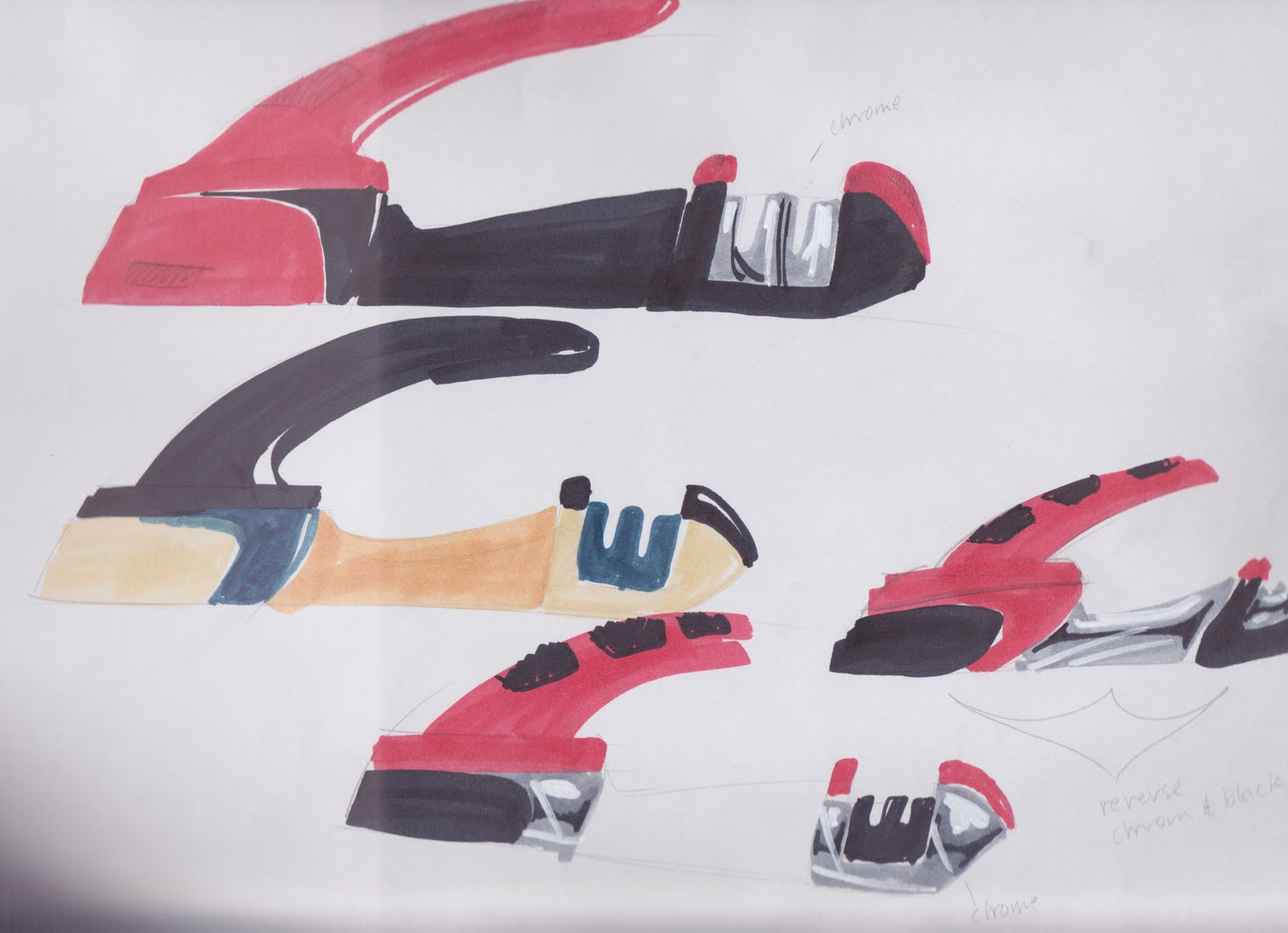
For my Knife sharpness measuring device, the colour scheme i have chosen and i think works the best, is a combination of one bright colour with additions of black and chrome. The bright colour will most likely be red as my design is meant for the kitchen and numerous objects in our kitchen are red. I feel that the black and chrome will give a nice sleek look to complement the red.

 i am however having much difficulty with deciding where the colours are placed as i am going to have a few separate parts. This is something i need to work out.

The intended material is likely to be a gloss plastic with rubberised parts for the grips on the handle and underneath.

LachMarsh


Hi all,
Choosing the colour scheme for my bicycle handlebar is a bit of a hard one for me. Because I'm only choosing to design the handlebars and not the entire bicycle itself, I'm struggling with going for colours, that when put on the body of the bike, don't appear to mismatched. 

Over the week, I've been looking at colour schemes that can be matched to any coloured bike body. It was easy to decide to just slap on black to the entire handlebar, but it seemed too boring. At the moment I'm looking into having black or a dark grey as the main colour of the handlebars, and having subtly coloured (perhaps white and lime green) regions to highlight little features, such as rubber grips, indents on the dial and key shapes. As white is rather neutral it seems to go well with most colours (similar to the image above), while the small applications of lime green will draw in the attention, but not appear to overwhelming in comparison to the bike body. Lime green was also chosen over other colours because of tendency of human eye to recognize more shades of green than any other color, in keeping with the 'visibility' theme.

Also, I'm wondering if there is a way to paint rubber. The guy at Clark Rubber said it wasn't possible to paint rubber because the paint would crack as soon as the rubber was moved. Please let me know, thanks :).

--
Cynthia

Colour Scheme

For my product the colour scheme needs to be fairly neutral as it is designed to be in an office/desk environment. I am still going through the process of choosing a final colour combination but it is either going to be.
1. White/light grey body body with black glossy details, buttons, dials etc...
2. Dark body with glossy details etc...

I have chosen these options as these colours are both neutral and most offices will predominately feature one of these two colours

Stefan

Friday, 21 October 2011

Colour Options

Hey everyone,
 
I've been playing around with different colour options for my measuring device, paying close attention to hand-held power tools.
 
My product is designed for industry; for someone who is using it on a regular basis. Most power drills are very bright and have contrasting colour combo's to make them stand out from objects around them, and I think this is an important factor to keep in mind. Instead of going for sleek silvery/grey shades that can sometimes blend into their surroundings, I've decided to take inspiration from the Ryobi power drill above that I bought dad for fathers day. One of the reasons why I bought it was because it was the first one to jump out at me when I walked into Bunnings, with it's strong lime green casing and charcoal grey rubbery grip.
 
The second image is a quick sketch of my device with this colour combo. I'm still playing around with different configurations but I really want to stick with the green. There are too many tools that have yellow/black colour schemes as well as orange/black combo's, so something a little different is always good. 
 
Cheers,
 
Matt Van

Road Rage Colours

For my road rage steering wheel, i tried a wide range of colours that looked appealing to me. The way i decided on my final colour scheme was based on two things:
1. How well it suited a car environment.
Since most cars don't have bright colours around the interior i had to choose some that were found more regularly such as; white, greys, black, creams and wood colours.
2. How well it fitted with the output (being to calm the driver).
A few of the colour schemes i choose had an aggressive feel to them which is not what i want for my design.

The final colour scheme consists of a satin white on the base plastic and a warm brown grey leather wrap for the upper grip.
Shaun T

Task Light: Colour Scheme

Apologies for the old image I'm showing here, there have only been a couple of minor changes, and none affecting colours.

For the vast majority of the form I'm sticking to the material's natural colour. For the frame, head unit and base unit that material is aluminium, so the colour will be that of a brushed metallic surface.

I've found a nice creamy cord to run down through the middle, so I thought I should only use one other colour to bring the cream and the metal together. What I'll refer to as 'accessories' (being the power plug, sliding knob, cord and strut connectors, twisting knobs and gear) will adopt a darkish grey (contrasting to both the cream and the metal). These minor details are dispersed about the form, creating a coherent visual pathway around the lamp. I think a dark grey for these will conform to the shades of grey produced by the gaps between the metallic panels on the base and the head unit.

I feel sticking to the basics colour-wise will suit my design.

Nicholas Avery

Assessment - and a call for volunteers

Hi All,

Firstly, I have marked your research 5 pagers and they can be picked up from my office. If you're in the workshop next week then pop upstairs on mMonday morning or Tuesday and I should be there.

Secondly, you might be aware of the 3rd year show which is happening from 6-9pm on Melbourne Cup DAy, here in the studio.

You're all invited to this show, and its a great insight into what's coming up in the following years.

Importantly, I need a few volunteers for the evening - you would be serving drinks for about a 40min shift, and therefore please contact me if you are available and have a valid responsible service of alcohol certificate (RSA).

please get in touch if you can help out.

best regards

Robbie

--
Dr Robbie Napper
Lecturer
Industrial Design
Monash University
p) +61 3 990 31059


Matching Designer Harness

Because my product will mainly be seen attached to a climbing harness I decided the colour scheme should tie in closely with those used by harness designers. The most widely recognised brand in climbing harnesses and accessories would have to be Petzl (you may know of them by head-torch fame). I am choosing to brand my device with the Petzl logo, so it makes sense that I should choose the brand's overarching colour scheme of black, grey and orange to use for my device.

I have attached pictures of a top of the range black, grey and orange Petzl climbing harness, as well as a slightly cheaper Black Diamond harness with a basic rendering of my device attached to the back.

Sam F

Wednesday, 19 October 2011

colour me....

Due to the nature of my heat sensitive travel cup and spoon, the
product will be available in a large range of colours. The aim is to
have a bright mitch and match colours for the lid, body of the cup and
the spoon, allowing users to pick and choose as they like or even
prehaps select a few different colours for those fashion conscious,
matching maniacs. The colours will of course change in tone to lighter
and darker shades depending on the temperature of the food or drink
that the material is in contact with. The cup will also come in two
sizes, one designed more for children and students with smaller hands
and another for working adults.

Inspiration for the design was brought about largely by the everyday
use of the throw away coffee cups from cafes and later by similar
products with a silicon material, which has proven to be a highly
durable and well suited material when dealing with food safety and
higher temperatures. Decisions throughout the design process have
largely revolved around restrictions regarding materials, form and
function while still trying to maintain a good level of aesthetic
appeal. As the model is still in progress, finer detailing and
decisions have still to be made and finalised. Its never really done
is it?

Steph Tan

Wednesday, 12 October 2011

IDE1112 Final Assessment Dates

Hi All,

Further to our informal discussions yesterday, and some negotiations on the timing of everything, here are the finalised assessment dates and times for IDE1112. It's good news for all.

Models: for all students, whether enrolled in model making or not, this is the 14th of November as per model making. For those in model making, I will assess your design as communicated in the model when you set these out in the workshop for Peter Farrer. If you are not in the model making unit, these can be submitted directly to my office on this date or before. If you're ready, you might even bring them to submission of:

The rest (Pin-up, folio, written conclusion): Due on the 8th of November, 1 week extended from the schedule. This will be a short 1.5hr session at 9am and 1pm where you can present your work and we'll wrap up the unit.

Just a reminder, there is no blog post this week. Next week is the last one, it will be on colours.

kind regards,

Robbie

--
Dr Robbie Napper
Lecturer
Industrial Design
Monash University


Tuesday, 11 October 2011

Phones

I just looked at the blog and realised that my blog post wasn't posted, so I 'm sending it again.


Many years a go now when I bought my first phone, I was confused by the disparity between the quality of construction and user interface in mobile phones and other products. My confusion stemming from the fact that phones were pretty crap, really.

It's only really with smartphones now that the gap in quality between mobiles and other consumer electronics has closed up. Nokia phones are sturdy as hell but their in-house UI up to this day is awful. All mid range phones from the mid 00's and before had terrible designs that buried potentially great features under catacombs of menus. LG, Motorolla and all other manufacturers had the same problem. Looking through my nokia E71 that came out maybe 2 years ago, it takes me more than 10 button presses just to get to the menu where I can change my ringtone.

It's only with the iphone (hey!) that phone manufacturers caught on to the idea that there was something to making a usable interface. That said, the UI of the iphone isn't perfect, the wall metaphor used to display apps gives the same real-estate to an app that makes fart noises as your mail client. I don't know how I'd make that better though.

I also think it is arrogant to basically port this interface onto their computer OS because moving your mouse to click on the apps just doesn't work as well. it was designed for touch screens.

Windows phone seven attempts to address this by assigning different sized panes for different apps, it feels more minimalistic but less functional I think. Even google's android, which is starting to take the place of the UI on every phone that isn't put out by microsoft or apple really just apes the iOS "wall". Also the store is really cluttered.

I feel like such a hypocrite complaining about this stuff though because I have no idea how to make it better.

-Tom Millward

Sunday, 9 October 2011

Tiny Mobile Phones

Ever since mobile phones first came onto the scene, the aim has always been to make them smaller and smaller. Early in the last decade this started to reach a peak which caused problems with the interface. I'm sure everyone here has at some point used a phone where the buttons are just too small. Before you know it you're mashing the keypad, putting in wrong numbers. It gets even worse when sending texts, which can be a pain to do even on larger sized keypads.

Overall I think this is a good example of a good idea that isn't well executed. A smaller phone is a good idea, as it is more portable and fits easier in your pocket or bag. However due to the ergonomics involved, it is easy to poorly execute it as it can end up too small for the hand to grip, and the buttons become to small to press easily.

The same deal applies to smartphones with full QWERTY keyboards on them. The buttons are tiny, and it even becomes harder to find the number keys, as they got lost in all the other buttons.

Andrew de Morton

Pedals and Wheels.

Cars are amazingly complex things.

In the current age, there are few people in the world who would be able to give a detailed explanation of the workings of each component on a modern car. However, driving a car is supremely intuitive for the vast majority of us, despite the fact we don't really know whats going on.

For me, the amount of control the average person, let along a F1 driver, has over their car is impressive and it comes down to interface of the car, the steering wheel, gear lever and  2 or three pedals. With these controls a person can control a lump of metal up to 2 or 3 tonnes in weight at speeds exceeding 100km/h. Not bad for a few thousand bucks. Not only can the interface control the car in a rudimentary way, the feel and weight of the controls are fine tuned so that the involvement is more exhilarating, deft and accurate.

Of course, cars haven't always been controlled this way, the model T ford had a completely different system which was apparently terrifying, you could either crawl along or hurtle down crappy roads with no real brakes at a locked speed like a tractor. The link below is from top gear, showing the development of the modern car interface.
But today all cars a pretty much identical in set up, even if the feel and weight of the instruments are fine tuned. The controls of the modern car have allowed every individual to operate a car safely (some barely) and brought personal transport into reality which is pretty neat.


Ed Hamer

Wii controller

I'll just start by saying that I was never a fan of the Wii when it was first released, because I found the idea of actually having to move in order to control a video game against the relaxing nature of gaming. But when I got over my cynicism I was pleasantly surprised. Firstly Nintendo completely redesigned the old 64 controller into a product you no longer need three hands to operate. The new controllers have been design to be consist of two separate parts; which means that the user can choose their dominate hand to activate the more essential functions. Each individual controller also has its own speaker which allows for personal sound feedback when playing multiplayer games.  They have also removed the 'C' directional pad and replaced it with a button, that when pushed, converts the current directional pad into the 'C' pad. This is a basic idea but when space is so crucial it has the ability to change the entire feel of the device.

The controller attachments also add to the enjoyment of interaction. The designers have really enhanced the product through this aspect. For me, the ability to actually hold a tennis racquet or golf club completes the interactive gaming experience. However this system does have its flaws, as anyone who has ever played Mario Cart with the wheel will attest to. Maybe it's just me but I just prefer the control you get with the nunchuck. Overall I believe the Nintendo Wii has changed the video gaming industry through the innovative way in which consumers are able to interact with the product.  


James Meikle 

TV/VCR Remote Controls

I am sure we have all seen different remote controls before, either at your own house or your friend's or relative's house. When you are using different remote controls from different brands, it gets quite frustrating, because they have completely different layouts. It takes time for users to get used to one particular remote. 

It is always a challenge for designers to fit all the functions and buttons onto such a small panel. But why can't they just keep the layout easy to use? I have found that there are many buttons on my TV remote that I don't even use or know what they are for. When there are too many buttons on one remote, users might press the wrong button and it could take them longer to find the right button. This gets even worse when you are using a remote at someone else's place. 

And with an universal remote, some people find it handy to just have one remote and use it for a few devices, such as TV and VCR. But I am never a big fan of that. I always like to keep and use the remote that came with the device, because those remotes are made particularly for those devices and they probably have certain buttons and controls. 

What could be annoying when using a universal remote is switching between ''modes''. Sometimes a button might have one effect when it is in TV mode and a completely different effect when in VCR mode. It gets confusing when one control can perform double duty. And error is most likely to occur, as the user must know, not only which button to press and also which mode it is in effect, especially when there is no signal to let the user know which mode they are currently in. When designing a remote, designers have purposely created modes to save space, so that the remote is small enough to be held in the hand. And also to save money by reducing the number of buttons and display, which are generally expensive design elements. 

I personally don't like too many buttons on my remote. It just makes it more complex to use. And sometimes the buttons are too small and uncomfortable to press. I must say there could be better ways to control TVs/VCRs with or without a remote.


- Hannie Choi
sorry the post below was by Avinda Fernando

the can opener

i chose to to critique the world famous can opener,

being such an effective appliance i don't now how we would function
with out one, it has made life so much easier and less stressful,
there are all sorts of cool designs in the market today to suit any
type of person. the standard can opener is generally ergonomically
pleasing with is organic curves making it quite a successful design,
though i couldn't help but realise one thing, that i am left handed,
and this has made life so much harder for me as i am the only lefty in
the family and the can opener we have is designed for right handers
meaning every time i use this appliance i generally snap the cutting
disc or break it in some way often leaving me hungry. this has made me
come to the conclusion that the appliance has got a very low score in
the area of user interaction/ effectiveness for all users. it is very
hard to find a can opener these days for both left and right handers,
you would probably need to go to one of these lefty stores and had a
look, i think that can openers these days all should come with a duel
handed use, in my opinion

Saturday, 8 October 2011

PlayStation Controller = Incredible Interface

I cannot go past the PlayStation controller for effective user interface.

Earlier this week I held one of these for the first time in a long time and I could not believe how amazing the device was, both in terms of interface and ergonomics - factors which, in a successful design like this are totally interdependent.

The buttons are designed so that they are easy to push and instantly reload, enabling rapid movement, without discomfort due to their flat surface area. They are placed in such a way that they are all able to be used without the consumer stretching their hand at all. Furthermore, the PS3 version has many advantages over the PS2 model including the trigger style shoulder buttons which create a lot more interface enjoyment than its predecessor.

I honestly have not felt more comfortable holding another device, especially another console controller, which brings me to my next point.

Whilst for me the PlayStation controller is the epitome of its kind, I thoroughly despise what Xbox has to offer.

It is both ugly and difficult to use, I feel like its interface does not need to be as complicated as it is, or at least the buttons could be positioned more effectively.

I'd like to think that my opinion is completely objective however, as I was brought up using a PS1 I feel that sentimental value may be a part of the equation.

Ashlee Shepherd

Respirator

The respirator is a great product which saves our lungs from various types of toxic vapours and dust.  Although not the most aesthetically pleasing product, the main purpose of its design is to protect our lungs whilst sitting comfortably on our face. The materials, form and colour scheme are not designed with aesthetics at the forefront of the decisions, rather the ergonomics have been the major consideration. The location of the filters and valves are largely determined by the need to create a certain weight distribution to make the mask sit comfortably, and flush with your face whilst trying not to reduce your field of vision. Even though there can be major improvements made to their appearance, the basic and purely ergonomic design is not out of place in workshops where most products share this attribute.

When first wearing a respirator the weight is the worst aspect of it, but after you get over that fact you forget you are even wearing it. When wearing the respirator by itself it works great, but the problems come when you are doing work which requires both a respirator and eye protection.  The tip of the respirator sits between your eyes making eye protection very awkward to wear. If using normal safety glasses they can't rest on your nose, but must sit up on the respirator. This makes the glasses sit at a further distance from your face which is both awkward and reduces their effectiveness of stopping flying pieces getting into your eyes. I have also tried wearing safety goggles which are styled like skiing goggles; these do not sit flush with your face but move around propped up by the tip of the respirator.
This problem has become more problematic in recent weeks when I have been wearing the respirator more than usual. This problem can be annoyingly be worked around, but wearing the protection of a respirator reduces the effectiveness of another piece of safety gear, the safety glasses. It may just be the respirator that I use which has this problem, but a simple modification of the design to make the seal sit further down from the bridge of your nose would solve this problem.
Jarrod Burge

Trimmer

When I started to think about products that have faults in their design, strangely enough the first thing that came to mind is my dads whipper snipper also known as an edge trimmer. This probably sounds like an odd product to come to mind, especially for a girl but I help mow and trim the lawns, and trimming using this whipper snipper has become a huge long process.

The whipper snipper my father owns is a Ryobi, 2 cycle petrol trimmer.  The main flaw in the design is that the starting up sequences is to long and complicated.  Edge trimmers are meant to make mowing the lawn easier and tidier, but neatly cutting the edges of the grass, so why make the starting up process so unnecessarily long and difficult.

Steps to start the edge trimmer:

1.              Put ignition switch in the ON position

2.              Fully press and release primer bulb 5 to 7 times (Fuel should be visible in the bulb)

3.              Place the choke lever in the FULL CHOKE position

4.              With the unit on the ground squeeze the throttle trigger and pull starter rope briskly until the engine sounds like it wants to run

5.              Place the choke lever in the PARTIAL CHOKE position

6.              Pull starter rope briskly 1 to 3 times to start the engine

7.              If the engine does not start repeat steps 3 to 6.

I do not understand how this products starting process needs to be so complex. The design of this product needs to have a look into this starting process because its to difficult. It would be so much easier if you only had to push one button or put one lever in a position then pull the starter rope to make it start, similar to how mowers start.   

Although other than this long process for starting up, the main rest of the design is very good, and satisfies the needs of the users. By helping to cut the edge of grass areas neatly it makes a mowed section of grass look neatly cut and fresh.


Kate

http://www.gardenmachinesltd.co.uk/ryobi-rlt26cds-starteasy-26cc-2-stroke-petrol-strimmer-239-p.asp 

The cows' revenge...

Ok, so who here has bought a 2L bottle of milk? Not the one or the three, but the 2L rounded oblong 'thing' that resides in your fridge. For those of you who have, I'm sure you would be able to relate to the impossible task of pouring yourself a glass of milk without having to wipe up any 'drippage' if I may use such a term.
 
So you go to open a new bottle; 9/10 times the the security ring comes off with the cap. Sigh. Grab youself a glass. Easy. You grab the tiny handle with three fingers (four couldn't possibly fit) and you try to aim the flow into the cup below. You may think you are aiming for your glass, only to find that the milk has founds its way down the side of the bottle and dribbling anywhere but where you are aiming. FRUSTRATING. You go to tilt the bottle further to cause what one could only describe as a MILKY WAY!! Not only have you not had your daily dietry requirement, but now you find yourself having to grab a ShamWow ;) to start wiping the bench. You soon discover that it has also gone down the side of the cupboard and before you know it you are on your hands and knees cleaning up what should have been in your glass in the first place.
 
Maybe one would think that I can't pour myself a glass of milk properly, but in my defence, the overall shape and handle design make a 2L bottle somewhat awkward to hold. Having the handle located on the top of bottle, makes it harder to control the effect of the weight the bottle has when pouring. The 1L bottle is fine because it is small enough to fit in ones hand, and the 3L bottle is easier because it has a much larger, proper sized handle that an average human hand can hold.
 
Where's the straw...
 
Matthew Van
 
Reference:

Hole In The Wall

Yep, ATM's.  Im not a fan if im honest, and I find it difficult to believe that a whole lot of thought was really put into the interface of your avereage ATM.
For starters, there all really low.  Now granted i'm quite a lot taller than most people, but when ever i walk up to an ATM i have to reach right down to use the buttons.  And once i've reached the buttons, the experience becomes none the more joyous. some ATM's don't bother to tell you witch way round the card must go, so i may well spit it back out and say try again, and then you have to navigate through the transaction with horrible buttons that often dont line up with whats being shown on the screen.  Many a time have I pressed the wrong button trying to figure out what the button is assigned to. 
My least favorite part of ATM's though is that to prevent pin code theft or the like, rather than incorporating some cover to stop people seeing your code or something along thise lines, the image on the screen suggests you cover your typing hand with your free hand.  Why?? How is this a good solution?? I personaly dont bother because to do this i must lean right down to get both hands to the level of the buttons, and it's all a bit of a fuss. 
Perhaps a little more thought should be put into this everyday interface.
Anyway, rant over.
Nathan Ide

The Dash

Without wanting to open a giant can of worms (no I don't think radios should be taken out of cars), I can't think of any car that has a dash that isn't designed to completely derail the drivers focus from being on the road.. With the growing abundance of features for cars such as gps, ipod compatibility, advanced driver settings for off road or sports vehicles, drivers are constantly being distracted by features that aren't related to the task of driving which are controlled using a series of tiny buttons. Now of course these are luxuries that people opt for, so that isn't really the issue, but rather the fact that the interface is cluttered with ten's of buttons and dials, often unlabeled or labeled with symbols that are unique for each model of car.
 But the most problematic flaw in a majority of these interface designs is the direction, which doesn't face the driver but rather the people in the back seat (who, by the way can't reach). Arguably this is because by having the screen flat on the dash it allows both the co- and driver to see it. but that isn't much of a consolation  for the when your only excuse for causing a 42 car pile up is "105.1 was playing Bon Jovi....AGAIN".

-Alex B

The Crappiest Invention of All Time

After much thought about this weeks blog post I have come to the end of the roll of choices to talk about, none other than the toilet. In particular the automatic flushing system that is available in some public toilets today.


Hands-free toilet technology has a real stink to it. There are three key points one must understand that a good loo should allow you to do.


1)    Clean the pool. No one likes to go on top of someone else's. A real difficult if you are jumping up and down in front of the sensor because the last flush did not leave a clean pool.

2)    Clean the pool, again. No one has to admit it, but I am sure some of us are more prolific than others. This is when the user wants to be courteous to the patron after so they do not have to experience Point 1.

3)    Courtesy flush. If you plan on dropping the kids off at the pool, and plan on spending some extra time there contemplating life or reading the newspaper. Please oh please, flush. The kids do not need to linger any longer than they need to. Send them on their way.


The automatic flushing toilet just makes the above tasks much harder. Not only that, it confiscates power from its users! I guess though people are expecting new technology even in their public toilets, and shopping malls are supplying them with it, and with saying that the technology is getting smart as time goes on and more economical. Especially with the advancement of sensors and their ability to decipher between dark and light, as they work on absorbing laser light instead of reflecting it back to the sensor. Although this sort of technology will cost more upfront, but the repairs are not arising because of people "drop kicking" the flush button like Jackie Chan, in avoidance to touch that dreaded flush button. The hygiene benefits win with the "hands-free" approach however, prior to this creation, the foot-pedal flush was working just fine. No questions as to what had touched that pedal before, because you are using the sole of your shoe. And hey, no worries if that first flush was not enough, just give it another boot and your loot will have gone down the shoot.


Just something to consider if you are reading this on an electronic device whilst taking some time out sitting on the throne, we all know you do it.


- mote


Resources:

http://www.youtube.com/watch?v=voPWIGAAxng&feature=results_video&playnext=1&list=PLB0E77127E5D06C2D


http://www.youtube.com/watch?v=BYW6C44zo24&feature=related

Fisher & Paykel washing machine and dryer

My choice of product this week was based mainly on personal use and experience. In terms of washing machines and dryers I believe that Fisher & Paykel have done an excellent job in designing an easy to use interface, especially for those of us who weren't so practiced in the art doing our own laundry. My old washing machine and a lot of the others that we looked at when it died had a few dials with a few numbers around them and that was about it. With the Fisher & Paykel interface there is no more room for excuses in terms of using the machines. For the last 5 years using this product has been effortless. The layout is read left to right with easy to change default settings and simply explained options. Now I'm not saying that it has to be this way as its not hard to remember which dials are turned to which numbers, but then again, who really cares.


In terms of the execution of the product itself, the quality is great. They are reliable and well manufacture machines that are easy to install. The other thing that made installation hassle free was the inclusion of 2 interface stickers to allow for the option of hanging the dryer on the wall (as in picture). Because of this you can also notice how they placed the power and start button together with the options on the side so that it didn't read an unconventional right to left when up side down.


The only downside I would have to say for these machines is the water and energy ratings, which are far from the leading options on the market today. With the electricity and water prices at the stage they are now, I would have to say this would most likely be the deciding factor, but in terms of interface I believe Fisher & Paykel hit the nail on the head.


Ps. Sorry for the poor image quality


Sean H

Digital Watch

There's was a lot of products that came to me when i was trying to think of something that didn't work just right, in fact just about every product is flawed in some way.  From experience I've found watches, mainly digital, but also multifunction analogue watches are notoriously hard to use.  A digital watch generally fits so many functions into itself but it also has extremely small space to fit buttons to control all these features.  A digital watch will generally have three or four buttons, these control all the different features of the watch as well as changing the date, time and alarm.  This is where most people come to grief, when i worked in a watch repair shop it was an almost daily ritual of someone coming in asking us to change the time, or how to set an alarm, they either couldn't read the functions on the buttons, there weren't any or they weren't even relevant, in some watches the light button is a main button in the setting process,.  Some were so hard we would sometimes have to hang on to it just to look up the instructions on the internet.

    I don't so much blame the people that designed the watches, they have an extremely limited space and,�if people want all these features then the buttons must be put on there somewhere.  Its just seems the case that unless you're willing to read and memorize (or keep handy) the instructions then you may as well just resign yourself to the fact that you're never going to properly be able to use your watch.
 
    Now, on a side note, i think this blog has a grudge against me, first it doesn't let me post pictures and now it won't let me comment, i'd ask if anyone else was having the same problem but if they were they wouldn't be able to let me know... so this blog would be up there with things that also, don't work too well.

Ross

Computerised Interaction Analogies.

Right; now this one may seem a little esoteric at first but as long as you keep in mind that I am writing about the idea of interacting with a device through an interface that allows for corresponding X-Y movement rather than the idea of a computer mouse itself we should all be fine.

On our side of the globe the invention of the computer mouse is attributed to Douglas Engelbart who to this day is still being awarded patents and who recently created an iPhone app version of another one of his inventions - the chorded keyboard.
Engelbart funnily enough pitched his work as a push to "change the world" and augment human intellect (as outlined in his 2008 book Evolving Collective Intelligence) - I'd say he's done a pretty good job.
On preparation for this post I stumbled upon an interesting post by Derek Sivers which explained the relationship between ideas and their executions as a matter of multipliers, here's how he explained it:

"AWFUL IDEA = -1
WEAK IDEA = 1
SO-SO IDEA = 5
GOOD IDEA = 10
GREAT IDEA = 15
BRILLIANT IDEA = 20

NO EXECUTION = $1
WEAK EXECUTION = $1000
SO-SO- EXECUTION = $10,000
GOOD EXECUTION = $100,000
GREAT EXECUTION = $1,000,000
BRILLIANT EXECUTION = $10,000,000

To make a business, you need to multiply the two."


Therefore even a brilliant idea with weak execution is worth less than a so-so idea with so-so execution...
I don't know if i agree with the direct mathematics of the explanation but I certainly agree with the interrelated format.


As a side note, I feel for this project I invested time and energy into cementing a good idea but I'm yet to hit the big bucks in terms of execution.

Anyway, back to computers. I feel that the core of the idea to interact with a computing device through basic directional analogies (i.e. as it stands now up, down, left and right) is in fact a good one; gone are the days that we lowly personal computer sit there scratching our heads in front of a flashing MS-DOS or UNIX command line. The interesting thing to note here is that despite the fact that mouses are an incredibly widely used interface they may not in fact be the best way to get your thoughts through your hand and onto the screen (or purely thoughts onto the screen but ill give it a few years yet). This idea does not usually bode well with a fair majority of computer users and it's easy to see that Engelbart has indeed changed our collective intelligence however over the last few years we have seen a shift that has been brewing for over a decade now the all knowing and all seeing touch (and lets not forget multitouch) interface. An early computer that sought to strip the mouse execution from directional interaction idea was actually the 20th anniversary Macintosh. My Dad used one of these as his work computer back in the day and for any of you Seinfeld nut out there one of these appeared on his desk without a mention during season 9. This machine was a strange one; it sported a Bose speaker system, a beefy 97 meg hard drive a 200 meg optical disc to teach you how to use the detachable TRACKPAD?! on a desktop?! 
I have since dug up said disc and it really does tell the story that Apple was trying to push of refreshing execution. As another side note Apple was also the first personal computer manufacturer to include a mouse - sure, it had one button but still.

Apple realised the imperfection in the market (one which they created) and sought to fix it and now the majority other unit sales have a touch interface with peripherals available for those who don't.

Two wheels to ball to optical to touch - a truly brilliant idea never dies while it is continuously refreshed in new and exciting ways.

-Tahl

Links:
Strangely formatted bit on Engelbart: http://www.ideafinder.com/history/inventions/compmouse.htm

Why are my hands still wet?

So we've all gone to a public toilet, sometimes in a rush, done our business, then washed our hands only to notice that there's no paper towel and instead we have to use a automatic/manual hand dryer. Their promise; to dry our hands in a top speed time. Only....where's the button? How do I turn it on? Why did it only dry for 10 seconds? How far away do my hands need to be? Why is it cold air? WHY ARE MY HANDS STILL WET?

I know that I've come across many different designs for hand dryers, many of them failing to do their job unless you stand there for more than 3-4mins in which that time you could've used a paper towel and gone back to partying. Many times I have found especially with automatic dryers that I have no idea where the sensor is, so I look totally stupid trying to wave my hands around the whole dryer and it does nothing. Even though there are dryers that tell the user where the sensor is, many of the times you have to put it a certain distance away/close to the dryer in order for it to turn on.

Another thing to consider with hand dryers is the user time, most of the dryers only last for about 10-15secs before you have to re-press the button or wave your hand, which can be pretty frustrating when you have to press a wet button and get your hands wet again. 

The latest in hand dryers is the design by Dyson, which I have had the pleasure of using before. What I do like about it is that it doesn't turn off until your hands are fully out of the sensor area. But while it is much faster than all of its other competitors I can't help but feel, with any hand dryer that my hands just don't feel as dry like when I use paper towel. I don't know maybe I'm just being picky..

Mey Chiam